Published January 25, 2016 08:20AM
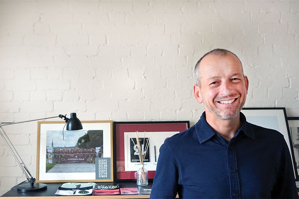
Sitting in with Rapha founder Simon Mottram
How did Rapha get its stripe? John Bradley talks to the founder of one of cycling's most distinctive clothing brands.
Twelve years ago, Simon Mottram launched Rapha, looking for something different from the dominant aesthetic of that era's cycling kits. Photo: Rapha
Before Simon Mottram launched Rapha in 2003, cycling’s aesthetic was one of loud colors, team-inspired graphics, and sublimated printing run amok. But just as Arc’teryx had succeeded in making highly technical winter sports outerwear that was at home on the streets of New York or Tokyo, Rapha proved that cyclists were hungry for sleeker designs — and willing to pay a premium for it.
Fast forward 12 years, and the British company’s minimalist designs and moody photos of riders alone on misty mountainsides have become dominant themes in cycling. If the Mapei kit and Mario Cipollini were the avatars of cycling fashion in the 1990s, now it is Sky and Jacques Anquetil. (The name “Rapha” is a nod to Anquetil’s old St. Raphaël team.)
We spoke with Mottram recently to find out how he settled on the designs and imagery that changed expectations of how cycling could look.
ADVERTISEMENT
VeloNews: When people think about Rapha, the first image they see in their mind is that stripe. What was the genesis of that?
Simon Mottram: I’m not sure if we’ve ever spoken about this, but way back about 12 years ago, we were sitting down in my kitchen and looking at what could these products look like. We must have gone through dozens. We knew we wanted them to be pared back and clean looking. We also wanted to have some kind of easy-to-see identity without using a big logo. If I’m not on a bike, I wouldn’t wear things that have logos all across them. So, on a bike, I wasn’t going to either. But you still want to have a distinguishing feature that people can instantly get: “Yeah, I can see that’s a Rapha thing.”
We looked at lots of stripes and art and colors, but when I saw the single arm stripe, I thought, “That’s got to be it.” The asymmetry was so arresting, so easy to recognize and difficult to forget. It just seemed completely right.
VN: It wasn’t so much the stripe as it was the asymmetry?
SM: A combination, really. The stripe’s about as simple as it gets, isn’t it? We could’ve put a crest or some kind of different graphic, but the simple stripe went back to the way we wanted the clothing to look.
Back in the late ’90s, early 2000s, it was still a pretty terrible look for cycling. There were far too many jerseys with pictures or swirly graphics and mad combinations of color. My burning question was, “Why should I have to sacrifice looking decent while I’m wearing performance gear?”
ADVERTISEMENT
We looked back to where things were at an earlier time, when you couldn’t create a day-glow jersey with a thousand logos just by clicking a mouse. If you wanted to put a logo on a jersey you had to stitch it up, embroider it, put an extra panel in. So designers had to use very simple graphical language to try to get these brands across. And it just worked. They were arresting. That was our inspiration.
VN: How about the marketing look — the sans-serif fonts and the black-and-white imagery? Was that all part of the same initial process?
SM: It was all part of the same discovery process, really — me spending a lot of time in my kitchen at night, poring over books. I was given a book as a present in 1997, a French book called “Le Tour de France Intime.” What was fascinating about it was that there were virtually no shots of people on bikes. All these photos were of these riders as human beings, shaving their legs, eating, in the bath, reading newspapers, smoking a cigarette on a train.
That made me realize that cycling, fundamentally, is a very human sport. The machines are beautiful, but they’re actually quite simple, as well. Ultimately it’s just you, your head, your legs, and your heart trying to get across the finish line or up the mountain. That was the way that I wanted our brand to connect with the audience: “We know why you love cycling. We love it, too, for the same reason.” So we don’t go to market by saying, “We make great jerseys.” We go to market by saying, “Road cycling is absolutely amazing.”
ADVERTISEMENT
For the first few years that stood out dramatically because nobody else was even trying to do it. But these days, a lot of people are. It’s certainly a much more interesting sport now to look at than it was 10 or 11 years ago.
VN: Did it help that your background was not in the bike industry?
SM: Yeah, I had zero cycling industry experience, aside from over 30 years of experience as a customer. I was a brands guy, so I just knew about developing brands. But the key thing was I was a bit of an obsessive cyclist. I had taught myself quite a lot about the sport, and learned and read a lot. That combination of having some knowledge and also having the outsider’s customer view definitely helped, I think.
VN: You’re no longer outsiders. And as Rapha has grown, it has become polarizing.
SM: Brands stand for something, don’t they? And if you want to mean something to somebody, the chances are some people are not going to like it. We were always really prepared to be polarizing. I’ve always said I’d much rather people loved us or hated us than if everybody just sat on the fence. Obviously you’d rather everybody loved you, but that’s not how the world works. So I’ve always been happy to be polarizing.
Ultimately I think more and more people will want quality and will want stories and content that connects them to the sport, and more and more people will trade up. Cycling’s too important to wear a scratchy jersey with a terrible zip.